H. Douglas Ives once placed swarms of bees in the midst of midtown Manhattan, but to inspire, not to sting.
High above the thousands who scurry and stroll along Fifth Avenue sit two beehives surrounded by buzzing bees. But they’re not live – they’re part of the dazzling decoration atop the Fred F. French Building at the northeast corner of Fifth Avenue and 45th Street. Ives, one of the building’s architects, felt that symbols could tell much about a building’s purpose and who worked or lived inside. The golden bees, he said, were placed there to symbolize the traits of industry and thrift. But are many of those walking in midtown Manhattan too busy and industrious to stop and take a good look at the building and its intensely colorful, beautiful panels?
To take a moment or two to gaze at the French Building feels like being warmed by sunshine breaking out in the midst of gray clouds. First there is the building’s color – a rich golden orange with setbacks trimmed by geometric and zigzag patterns of deep red and black, gold and lime green, in the midst of a sea of many huge boxes, in beiges, grays, and browns. And then, at 38 stories tall, it’s topped by multicolored glazed panels with those symbols Ives spoke of – a fiery rust-orange and gold rising sun over cobalt-blue waves, griffins with golden wings, and the head of the god Mercury. Paraphrasing from Ives’ description of the style, I’d call it Mesopotamia meets midtown.
Such features are what I call architect’s touches – the visionary, quirky, outrageous, or inventive design elements that cause a building to stand out from its neighbors and that often help make it a living thing delighting those in its midst long after that architect is gone. They are building elements that catch the eye and make one stop suddenly mid-step, just to gaze at a carved archway or a sign that transports you to the 1920s.
Many people tend to think of New York City architecturally as a city of monumental landmarks, but it’s as awe-inspiring as a collection of countless details and features that architects chose at the time of creation. Three favorite buildings in New York that display those eye-engaging architects’ touches are the French Building, the Verizon Building – originally the New York Telephone Building – on West Street in lower Manhattan, and the old McGraw-Hill building on West 42nd Street.
The Fred F. French Building
It’s not surprising that Fred F. French wanted to make a strong, somewhat splashy statement with the building that he erected on Fifth Avenue to house his development company in 1927. He was the developer who bought up lots in a rundown East Side neighborhood known for small tenements and bordered by smelly breweries and slaughterhouses, and built Tudor City there.
French was an audacious guy who financed his real estate developments through his “French plan,” in which average people bought up shares like common stock and earned returns. He gave pep talks many mornings to his employees. So it’s fitting that his company building was a statement full of symbols that were meant to convey high-minded purpose and ideals. They are a feast for the eyes.
Start at the top as you take a look at the French building. Facing north and south you’ll see two of the richest polychromatic panels to top a building anywhere. Were they at ground level, surely passersby would stop in front to check them out. But in this case, a good vantage point is standing about a half-block south on Fifth Avenue to see the top of the French building. In the center of the panel (as it is on the north-facing side) is a golden sunrise, with bronze and brown rays, above cobalt-blue waves. To the side of the sun are two yellow-gold winged griffins, legendary creatures that combine a lion’s body and eagle’s wings. Then at the outside of each panel are yellow-gold beehives with bees swarming around them.
The architects, Ives working collaboratively with John Sloan of the firm Sloan & Robertson, chose these symbols deliberately. As Ives explained, symbols have always been important to express the purpose of a building. The rising sun, he said, signified progress, while the two griffins — beautiful creatures known through legends for their power and strength – stand guard, representing watchfulness. The bees around their hives were intended to give a picture of purposeful work and thrift.
Standing back on West 45th Street and looking upward, I see another bright panel, with a grayish-white face carved into it, surrounded by rays of golden sun. This is the god Mercury, known in Roman mythology as a god of trade and commerce. When I look closely at it, the face appears to be looking back down. Besides these symbolic features, the building has plenty that’s just plain pleasing to the eye, like the bands of terra cotta with lime green, red, gold, rust, blacks, browns, in shapes such as diamonds and circles.
But the touches that these architects created for the French building weren’t only meant for those gazing upward – they were also for those at street and lobby level. Walk through the arched gateway on Fifth Avenue, of bronze, richly detailed with flying horses, leaves, flowers, and other elements, and you feel a sense that an entrance into the building and exit out to the avenue were supposed to be grand.

The lobby ceiling of the Fred French Building, at holiday time
Inside the lobby, the architects carried through the theme of Near East imagery, with winged horses, golden birds, flowers, leaves, all rendered in rich deep blues, dark greens, and gold. The elevator doors alone are works of art, each with different human figures on them, such as woman who is holding up a building and a man reading a book. In the midst of such buildings celebrating modernity in the Twenties was this often-rendered appeal to our ancestors.
Barclay-Vesey Building
Like H. Douglas Ives with the Fred French Building, Ralph Walker wanted to catch the eyes of those passing by when he designed the shape and the detailing of the New York Telephone Company headquarters in Lower Manhattan. Through the particular touches that he gave the Barclay-Vesey Building – as it was known for its two cross streets – Walker sought to create a building that captured attention both from a distance and up-close, something that’s difficult for architects to achieve. But in this, he was a rare exception.
Walker once wrote that the building might have looked like a series of gigantic packing boxes were it not for a design choice. He was influenced by the design that Finnish architect Eliel Saarinen had done for the Chicago Tribune building in 1923, with graceful setbacks that climb to progressively a smaller crowning at the top. For the Barclay-Vesey building, located at 140 West Street, Walker designed vertical piers rising up from the granite base, giving it a soaring quality, capped by buttresses and limestone ornamentation. Walker intended for this building – the second-tallest in Manhattan at its completion in 1927 – to stand out on the skyline for those seeing it from the Hudson River.
But Walker also kept in mind, as he wrote, “the interest of the passerby, whether he is a commuter, whose approach to the city is at the building’s foot, or a user of the markets in the immediate vicinity.” For at the building’s base at street level, the architect created beautiful panels: limestone sills, arches, and horizontal edges carved with flowers, fruits, vines, small babies, animals, so intricate that it’s almost like one of those children’s search-for-the-object puzzles where one looks and keeps finding something else.
Walker once wrote that the building was “cliff-like,” which would make the ornamentation a 1920s version of the art that the ancients drew along cave walls and cliffs. The carving has been described as Mayan-inspired. To be sure, Walker noted, he wasn’t looking backward to Greek temples or Gothic cathedrals – the kind of structures that architects of the day often drew on for their inspiration. Employing this free-flowing ornamentation, he aimed to create a very modern place, worthy of housing the latest in telephone wizardry. In this, he was a kind of pioneer — the New York Telephone Building attracted lots of notice and praise in published journals and influenced other architects to try their hand at such creative forms. The building that now houses Verizon’s world headquarters is sometimes called the first Art Deco skyscraper in New York.
Perhaps Walker hoped and even sensed that the detailing that he invented for the panels would outlive him and amaze the average “passerby” for decades to come. But he couldn’t have predicted that they would fall victim in a violent attack and be severely damaged by debris in the attacks of September 11 – and then lovingly restored. Steven Saraniero, the partner in the firm of William F. Collins Architects who oversaw the restoration, says he could spend a month discussing the building, its storied history, and its many fine touches.
The detailing on the limestone panels “carries your eye through them” as you stop on the street, observes Saraniero. As the restoration team was working on the panels, “every day, we would discover something….and I’d say, ‘my gosh, I never that saw that.’ I didn’t see that squirrel.’ “ That’s exactly the kind of design choices architects create that simply delight the eyes.
There was another way that Walker kept in mind those who walked around the building – an arched arcade that provides a covered sidewalk. The 19-foot-high, 252-foot-long arcade has rounded archways and a ceiling of Guastavino tile (named for the Spanish architect/builder who developed this tile arch system in the 19th century). The original Vesey Street was quite narrow. The curb and building lines were moved on the street, so Walker devised the arcade, he said, to provide a wider, safer, and sheltered sidewalk for pedestrians walking from the New Jersey ferries and other places. As I walk under its archways, I feel I am walking in an ancient space as much as one in 21st century Manhattan.
All in all, with its soaring piers, eye-capturing ornament, and tile-roof arcade, Walker’s Barclay-Vesey Building has the kind of architects’ special creations that make it a timeless building for all ages.
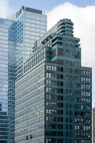
McGraw-Hill Building
When Raymond Hood designed the McGraw-Hill Building on the west side of midtown Manhattan, he, too, thought of what might particularly grab the attention of those in the neighborhood. But some reacted so strongly to the colors and features of his building at 330 West 42nd Street that they called it a stunt and worse.
In my eyes, it’s anything but that. The deep greenish-blue building, built in 1930-1931 during the throes of the Great Depression, was the headquarters of giant publisher McGraw-Hill. At the time, the skyscraper was off by itself on the far west of 42nd Street, and the publisher hoped it would inspire others to follow McGraw-Hill into the area – though they didn’t for decades.
Hood was an imaginative, accomplished architect who often went beyond the accepted and traditional. In styling this building, he was not only unusual but he went a little wild. Boring this isn’t. He designed the 33-story skyscraper with horizontal bands of metal-framed, factory-like windows that would let in a lot of light. These alternate with bands of glazed blue-green terra-cotta brick. I see the skyscraper’s industrial look and think of an era gone by when many more products were made in New York City. On the building’s lower floors I can envision the printers of that day with ink on their hands binding journals such as Electric Railway Journal and Coal Age.
330 West 42nd Street
Photo: Paul Houle, Wikipedia, CC BY-SA 2.0
Atop is a feature I’ve loved for years: a sign that says “McGraw-Hill” in boxy, light-green, 11-foot-tall letters at the top. Keep in mind that this was not a time, like today, in which companies brandished their names on every little foot of public space in flashing electronics. The huge sign was originally painted white with an orange stripe. Architect Robert Stern wrote that the use of the color and the sign at the top were intentional efforts at “shock-value advertising.”
Shock value for the day? It most definitely was. Lewis Mumford termed the building a “stunt,” and it drew other howls in the architectural press. But today when I walk along Eighth Avenue, look up at the bluish-green bands on the 42nd Street building and glance at its Jazz Age sign at the top, I feel a tinge of 1930s New York.
And I thank Raymond Hood.


Great post! Congrats on getting Mindful Walker up and running! I’m looking forward to taking many mindful walks with you. Best, Monica
This is wonderful stuff! You are helping me to rediscover and appreciate what I took for granted living all those years in NYC..keep up the good work and thanks for letting me tag along with you..
Congratulations!
Val
Thanks, Val! Glad it’s helping you to rediscover what we all can easily take for granted about New York City, and I’m gratified that you’d like to “tag along.”